The Challenge
Visualizing
Company’s Philosophy
Wellness Hut is a young Canadian brand dedicated to promoting healthy natural solutions that aid the wellbeing of modern men and women. The company’s mission is to offer quality products at a fair price with a sustainability idea in mind. Our studio was contracted to develop the brand name and brand design that will reflect the company’s philosophy and be illustrative of its values.
Client
Wellness Hut
Services
Brand Strategy / Visual Identity / Art Direction / Package design / Tone of Voice / Marketing Materials / Web Design / Web Development
Date
2018 - Continuous Client
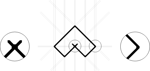
Logotype Design
Minimal Form
Rich in Meaning
The brand logo has the form that was constructed by uniting the shape of the letter W and a hut roof. This simple and seemingly abstract form is combined with round and elegant typography.
Minimal design is what differentiates this brand from its competition suggesting at the same time, the high quality of its products. The lack of excessiveness in the design symbolizes the sustainability value that the brand is trying to promote.

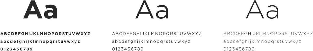
Typography and Color Usage
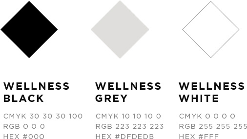
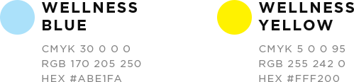
Primary Color Palette
Accent colors

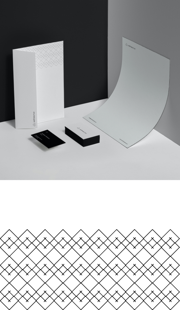
Brand assets
Evolution of the
Brand Elements
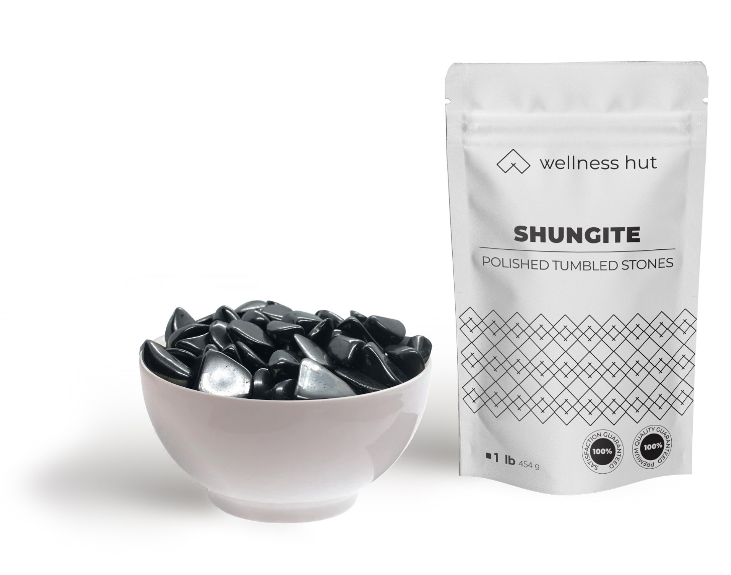
The shape of the logo served as inspiration for different patterns that were developed for packaging purposes. Some patterns were used for the company’s promo materials and some for the product packaging, precisely for the shungite stone products. This stone is believed to protect from harmful radiation and to have healing powers. It is entirely black, and it looks fits well with the brand’s black and white identity.


Labels
Minimalist
design
Different packaging types were developed using the minimalistic design style with only one extra colour added to distinguish between different products. Also, a premium black packaging was designed for the products made from the purest form of shungite stone.


Package design
Eco-friendly
sustainable packaging
To support the sustainability element in the brand’s philosophy, all packaging is made from recyclable paper, and any future packaging products will be developed using either paper or wood materials.

Brand assets
Package
Design Elements
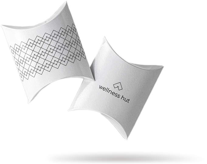
Foldable 2D to 3D packaging is used to store shungite necklaces. This kind of packaging is practical and easy to produce while at the same time, minimalistic and attractive. Combined with the logo design, it adds extra value to the product inside.


Inspiration
Sticking to
the Roots
We designed a set of cutting edge layouts and visual elements that reflected Our inspiration came from the traditional Canadian lifestyle that was very much in sync with Nature; therefore, we chose the’ Wellness Hut’ name.’ Wellness’ is what the company is all about, and ‘Hut’ is a warm, comfortable, protected space somewhere in the Canadian wilderness. In this way, we addressed the basic need of modern people to return to Nature when searching for peace, health and comfort.

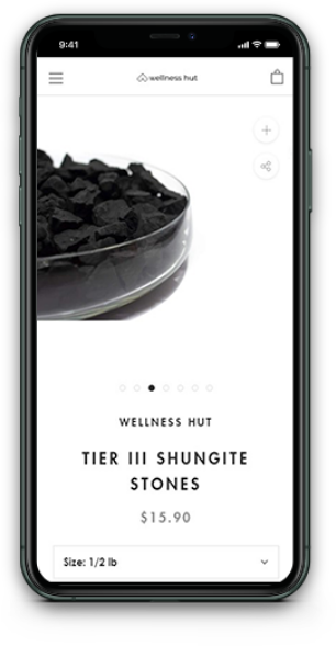
E-commerce
Responsive
Website Design
Device responsive website for Wellness Hut was designed and produced. It contains company presentation, blog and online shop. The website is minimal and easy to navigate with large and attractive pictures of the products that can be purchased online with a few clicks. The Colour scheme is reduced to achieve an elegant and airy atmosphere and direct visitors’ attention to the most important information on the page.