The Challenge
Digital Identity
and Website Redesign
Filip Filipovic, the captain of the Serbian national water polo team and A team Pro Recco player, named the best player in the world in 2011 and 2014. asked us to help them move beyond his old site and to create a completely new experience for his fans and sports audience. We delivered a new web and mobile experience and prioritized sports information that users wanted the most.
Client
Filip Filipovic
Services
Logotype design / Website redesign / Photography / Improving mobile user experience / Development
Date
2017 - Continuous Client
Logotype Design
Filip’s signature into
a personal symbol
For a more powerful promotion, we created a brand around Filip Filipovic’s name. We came up with few concepts, since FiIip’s signature was already famous we decided to use his signature by adding small amounts of stylization.

Typography and Color Usage

Primary Color Palette
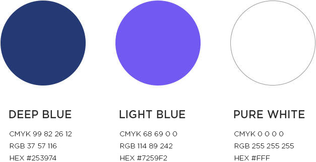
Secondary Color Pallete

Website redesigned
discover how it’s made
Since we love collaborating with clients, we worked together with Filip to define, test, and design the new experience. We spotted the weak points of the old website: namely that the website was not mobile-friendly, the information structure was weak and the design was out of date.
We set the information architecture and rethought the experience. Since the main purpose of this site was Filip’s promotion and fan interaction, the layout is adjusted to the fan’s needs, we came up with the solution with an interactive slider that will navigate users to the main categories of their interest which are the facts about Filip’s Career, Image and Video galleries, Sports news, Fans Corner.
Rethinking the
Experience
With Filip’s fans in focus, we had to redesign the new assets to be more exciting, more interactive – they needed more photos, video, more visuals. We archived a balance of aesthetics and function.
We developed a custom-designed interactive theme on the WordPress platform.
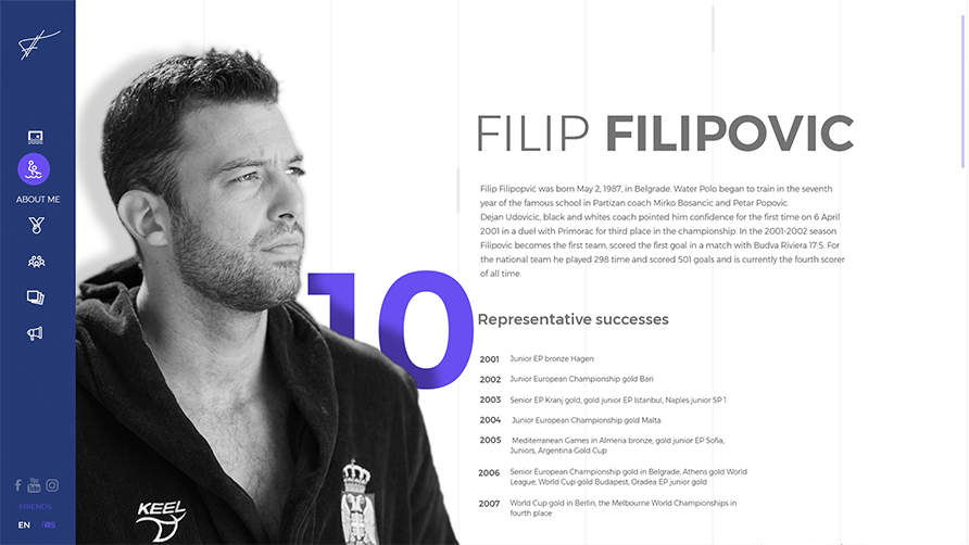
About Filip
Filip’s biography is rich with many successes. It was very important to depict his entire career chronologically by highlighting the most important achievements in his career.
We chose animated graphs to highlight Filip’s impressive accomplishments.
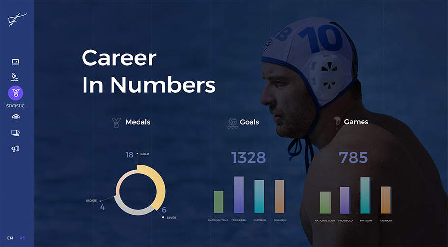
Statistic
Filip’s career being very impressive, we wanted to show some aspects of it using as many statistics as possible.
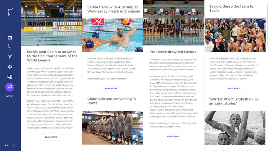
News Feed
The greater part of Filip’s work is well documented, but also the news that you can find out first hand, directly from Filip, is on his site.
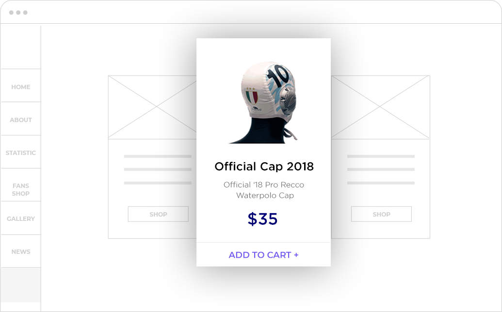
Integrating Shop
One of Filip’s requests was to promote his team’s merchandise, but without adding an actual shop. So we extracted products from his team’s website’s API, and listed them on Filip’s website.

Photography direction
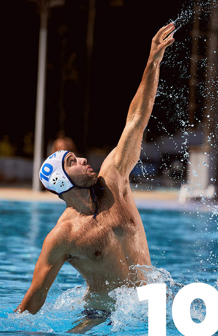
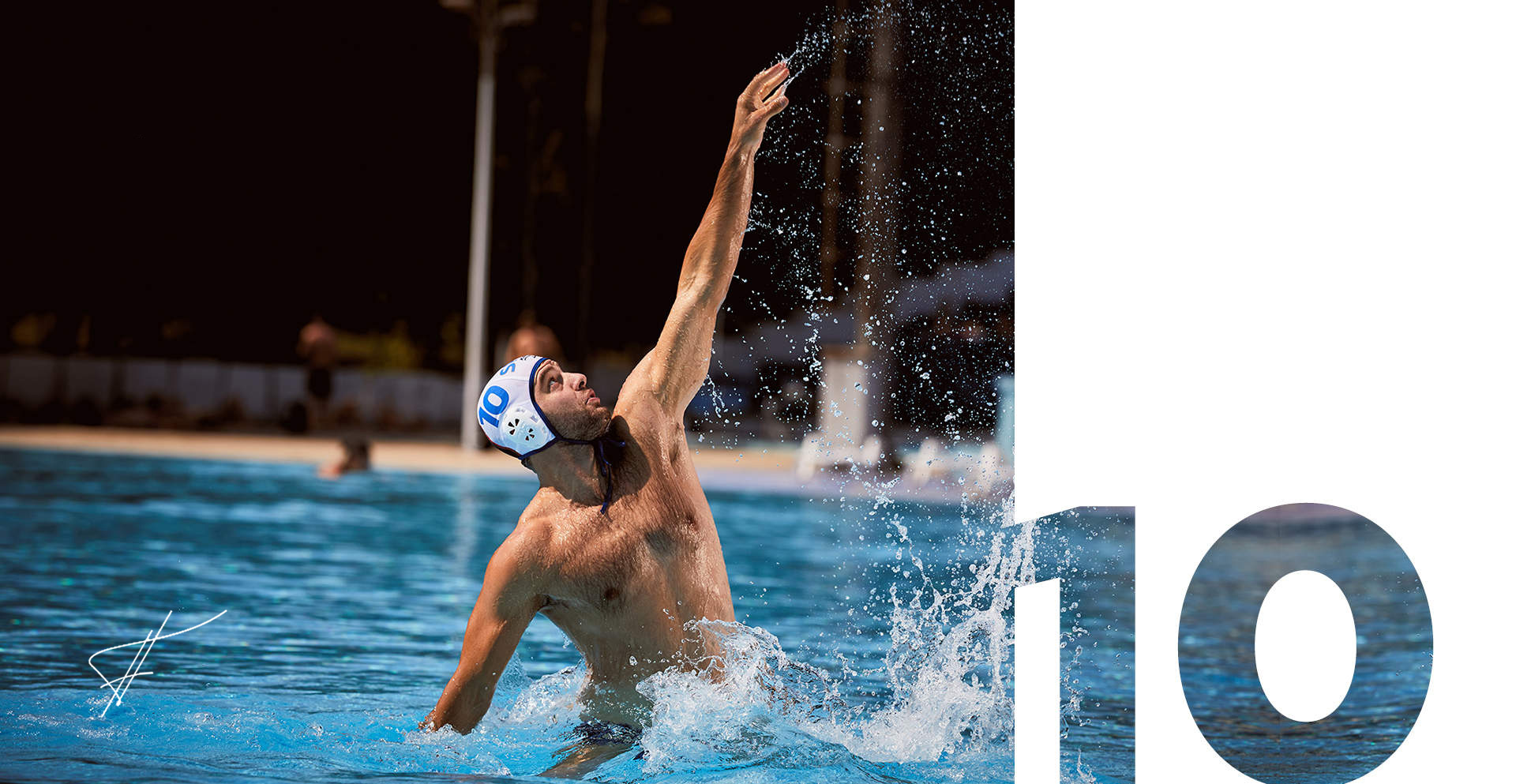
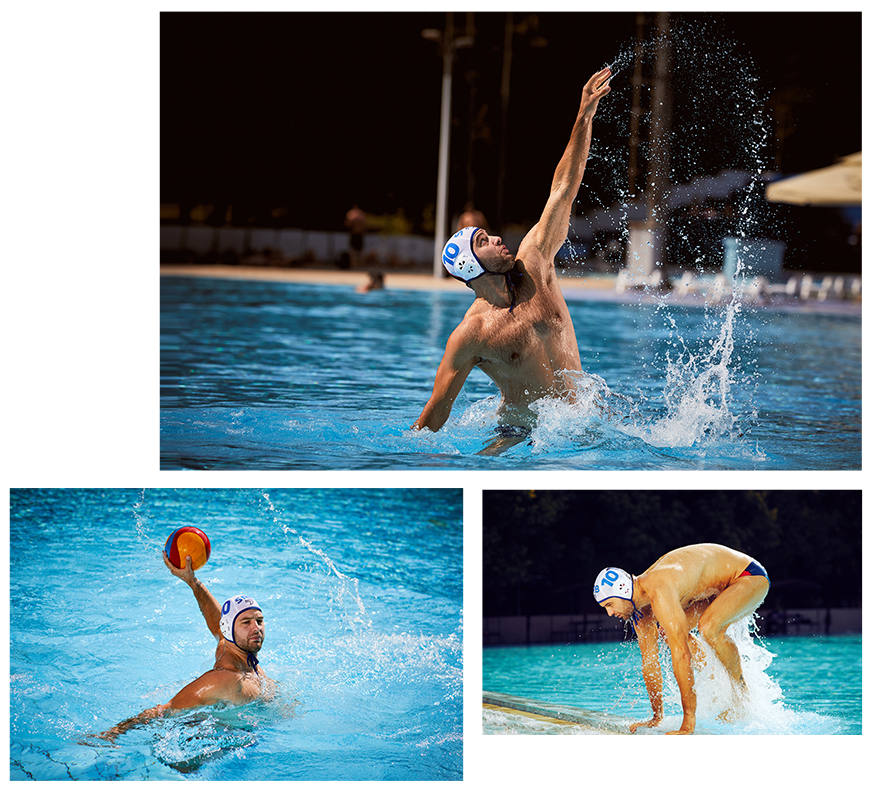
To make a photo campaign aligned with Filip’s identity, we decided the photoshoot should take the place at the swimming pool where Filip started his career and where he became most popular. The idea was to take photos that will highlight his dedication to pushing his own limits, his focus, and motivation.
Improving Mobile
Experience
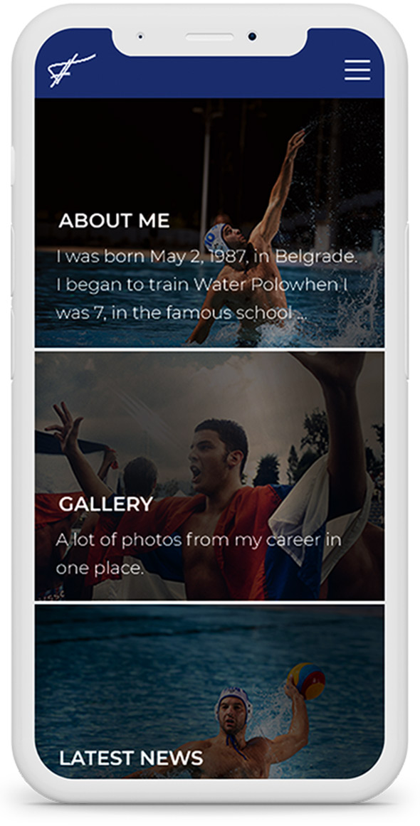
By maintaining the same look and feel of the website using a responsive design, we were able to offer fans content that they could easily access and comfortably navigate from any device.
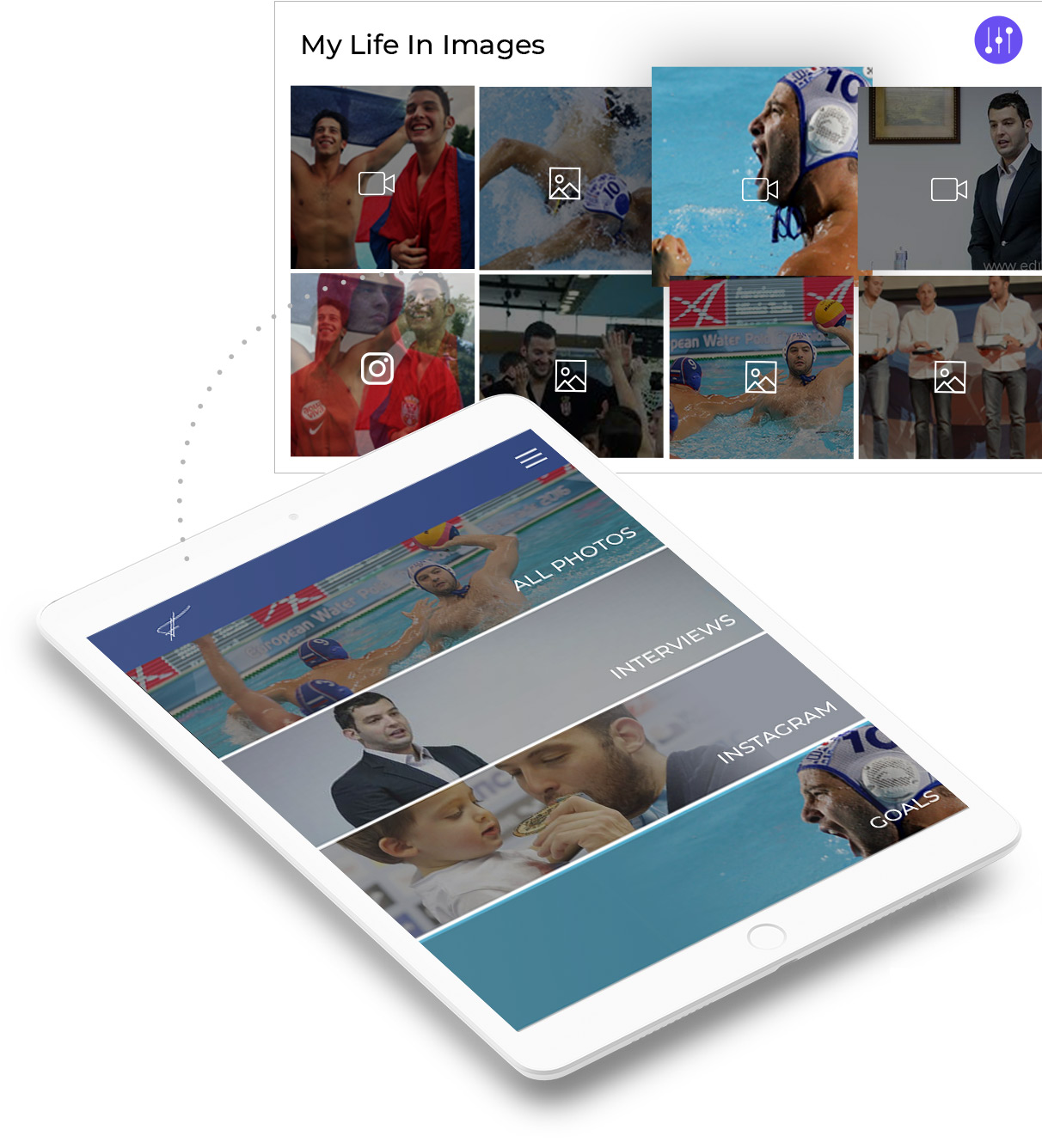
Multiple galleries
Most fans want to know the private details of their hero. One of the ways to get closer to your hero is through the image gallery that contains photos of the private life of this great athlete. Linking his Instagram profile to one of the galleries may have been the most effective way to get closer to him.
